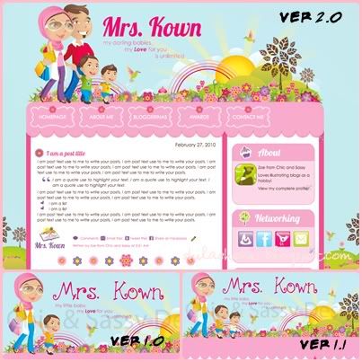
Ok sons, I have added your daddy illustration to my blog header so it gives off more family like feeling compared to the former one. Not only that, I've changed the font on my header, sidebar title and post title to something bold compared to the previous curly child like font.
What else? Owh, I changed my signature and the post divider to a new design, and added this share buttons to my post too. On top of that, the most commonly used networking icons have been added in my sidebar, but just a little note here, I will still be selective to approving my FB requests. Hahahaha. So do give a line or two of intro, at least for me to know "siapa yer orang ini?", especially when we don't have any mutual friends in list. ;)
So, how do you like my blog new look? Ok, not so new, just a little bit amendments of here and there but I love it more than what is was before. Thanks Zoe because she did a great job here, even though it takes a while to complete because of the waiting list. And I will try to update my blog as often as I can, or at least in the same consistency of one entry per day. Tapi tu lah, if time permits because I only have two hands with two boys to handle and never ending things-to-do. Jadi saya akan coba lah update belog dengan sedaya upaya. :)


No comments:
Post a Comment